Any marketer or entrepreneur who’s agonised over split-tests will understand what happens when you alter the shade of a background, button, or image.
Colours evoke emotions, convey subliminal messages and most importantly, have a huge impact on our decision making process. As a marketer who cares about anything that will improve results by a mere 1% (because I understand the long-term implications of every percentile), I know the psychological power of colour.
A recent study (Shortstack, Kissmetrics) has revealed that 84.7% of consumers cite colour as the primary reason they buy a particular product, and that ads in colour are read 42% more than the same ads in black and white.
Ads in colour are read 42% more than the same ads in black and white!!!Click To TweetThose figures are huge! And it shows that colour is not a basic element that you can simply skip over.
In this post, we’re going to analyse the most commonly used colours in marketing, so you too can understand their psychological power, uses and real-world applications.
Strap yourself in, because we’re going in deep.

Contents
The Psychology of Colour in Marketing: Primary Colours
Primary colours are the first layer on the colour wheel and the building blocks for every other colour.
Red

Psychology of Colour: Red’s Effects
Red is a colour that dominates. It has huge psychological and physical effects on viewers and is widely used in marketing. We associate it with two of our most powerful psychological triggers:
- Sex
- Death
Red can be used to display romance, love and sexuality, as well as aggression, blood and evil. It’s these triggers that make red such a powerful attention grabber.
Its power to draw the eye also increases importance. Think of the red carpet as a great example of this.
The colour has also been proven to have physical effects, increasing blood circulation, breathing rates and even metabolism. This increase in metabolism actually creates hunger, and is one of the reasons that most fast-food chains and restaurants use red in branding and promotions.
Psychology of Colour: Red’s Uses
Red’s ability to draw attention and create importance make it an attractive proposition, but, due to its dominating nature, it should be used sparingly.
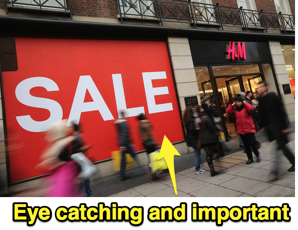
The colour is perfect for short-term, irregular promotions like FLASH SALES and offers. The next time you walk down the high-street, look for a shop with a sale sign in the window. I bet that sign’s red. If you’re going to use it, I recommend you do it the same way.
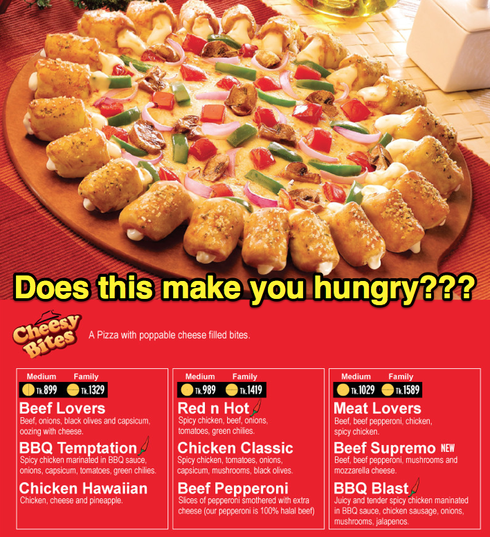
Unless, of course, you’re in the food business. Red is used as a primary branding colour by McDonalds, Burger King, Pizza hut, Dominos, Panda Express, KFC ,Wendy’s, Papa John’s…
…the list of giants goes on and on. Use the physical effect on metabolism to increase order sizes and your average customer value.
Most Suitable Industries/Products
- Food or drink
- Sales/Discount stores
- Adult
Yellow

Psychology of Colour: Yellow’s Effects
Yellow is an interesting colour. It can have differing effects, depending on its shade.
Light and bright yellows incite happiness. They trigger thoughts of summer, sun and warmth. The psychological effects of this activate optimism and positivity…
…but, the same shade of light yellow can also act as a warning sign. Road signs and ‘caution’ tape is a great example of this.
Darker yellows like gold, create a sense of wealth, importance and antiquity, which is particularly useful to brands trying to push towards the high-end of the market.
Psychology of Colour: Yellow’s Uses
Yellow’s ability to create optimism and happiness is a powerful stimuli in campaigns that are trying to create energy and demonstrate playfulness.
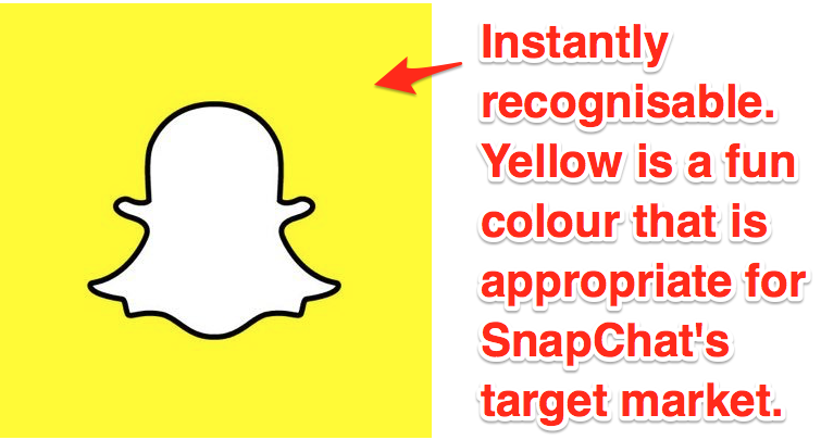
It’s an eye catching colour and brands that use it are instantly recognisable.
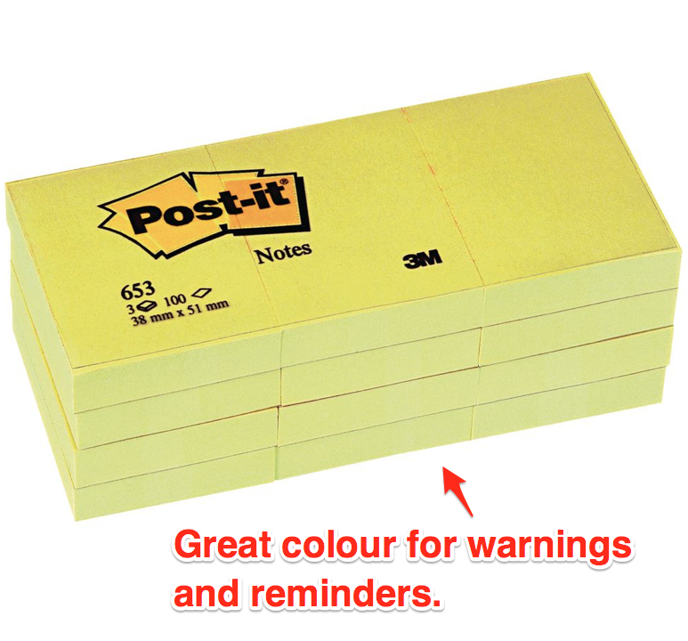
The sense of warning that light yellow triggers is useful for creating reminders. Brands like Post-It have used this link to build their profile in a very broad, unprotected market.
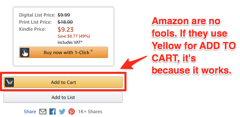
It is also used in this way by the world’s biggest online retailer, Amazon as an ‘Add to Cart button’. Their investment in conversion rate optimisation proves that yellow really can have a powerful effect on buying decisions.
Dark yellow, particularly on a black background, is often used by brands trying to create an air of luxury around their promotion.
Most Suitable Industries/Products
- Children’s products (bright yellow)
- Luxury/high-end market (gold)
- Summer products
Blue

Psychology of Colour: Blue’s Effects
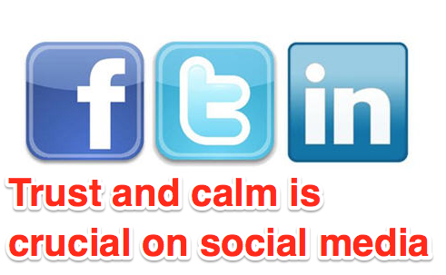
Blue is the internet’s colour of choice and there’s good reason for it. It’s on more websites than any other colour and that’s because it triggers trust, calm and honesty
Blue is incredibly versatile too. The lighter shades are vibrant, eye-catching and fresh, with clear links to crystal clear seas and summer skies. These brighter variations of blue have refreshing effects too, making it the perfect backing for a whole host of different companies.
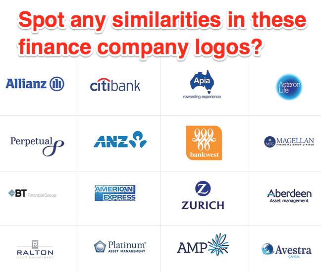
We link dark blues with security and trust, making them the perfect choice for banks, finance and other similar professional industries.
Psychology of Colour: Blue’s Uses
Blue is a great choice for any brand selling ‘black-box’ products. A black-box product is something that cannot be seen or touched, think banks, software, security or marketing services.
As the colour of trust, it’s also a great choice for campaigns that deal with health. Consider the toothpaste in your bathroom, does the branding include any blue? Oral-B, Aquafresh, Crest, Macleans, Arm and Hammer and Sensodyne, all feature blue in their branding. The same applies for many other niches selling health and fitness products.
With its strong links to security and trust, dark blue becomes a great option for businesses who deal in professional sectors.
Dark blue is a great option for businesses who deal in professional sectors.Click To TweetDespite all its useful applications, blue does not work well in the food industry. There are very few natural foods that have any blue in them and as such, the colour has no link to eating, hunger or food. If you’re selling food products, steer clear of blue.
Blue should not be overlooked as a powerful colour for your marketing campaigns though. It has strong psychological effects that clearly link to buying decisions. If you’re aiming to increase trust, use blue (with white) on your landing pages.

Most Suitable Industries/Products
- Health and wellness
- Software
- Professional
- Social Media
- Financial
Secondary Colours
Secondary colours are the next layer on the colour wheel. They are the result of mixing two primary colours. E.g. red+ yellow = orange.
Orange

Psychology of Colour: Orange’s Effects
Orange is an interesting colour and from my experience, the most overlooked colour when it comes to marketing (I’ll explain this in further detail in the ‘Uses’ sub-section).
Orange is similar to red in that it also creates physical effects (breathing, blood pressure, etc.), but to a smaller extent.
It brings energy, playfulness and excitement to a marketing campaign, and these triggers can create impulse clicks and snap decisions.
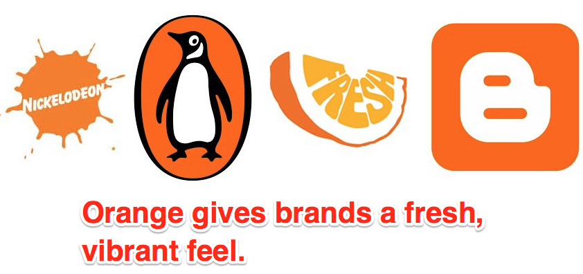
This secondary colour also adds vibrancy to a website and always draws the eye, but it has its down sides too…
…because of its playful, youthful feel, orange can make your site, brand or landing pages feel cheap, especially when its overdone. If you’re targeting the luxury market, avoid this colour.
Psychology of Colour: Orange’s Uses
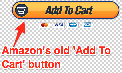
There is a commonly held belief that the best converting ‘add to cart’ and buying buttons are Green, and there’s sound psychological reasoning behind this…
…but, why is it that Amazon, the world’s biggest online retailer use orange as their ‘Buy Now’ button colour? And, why did they also use this as their ‘add-to-cart’ button before switching to a two button strategy?

In all our split-tests, orange regularly comes out above green when it comes to CTA’s. This might have something to do with its cheap feel, but it also might be because Amazon has created a psychological trigger by using it.
Think about it, you’ve probably bought something from Amazon and that means you’ve hit an orange buying button. If you’re presented with one again, you’ve been conditioned to click it to buy.
As well as buying buttons, orange is a great way to emphasise a friendly, welcoming service and demonstrate creativity. If you’re in a creative industry, don’t be afraid to use it!
Most Suitable Industries/Products
- Creative
- eCommerce
Purple

Psychology of Colour: Purple’s Effects
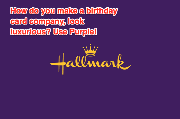
Purple’s most prominent psychological trigger is that of nobility and royalty, making it an amazing choice for brands aiming for luxury and elegance.
This secondary colour comes at the complete opposite end of the spectrum to orange. It creates feelings of mystery, romance and maturity and has incredible high-end appeal.
Purple’s connection with wealth and decadence make it a great branding choice, but offers little in terms of impulse buys, marketing material and CTA’s.
Psychology of Colour: Purple’s Uses
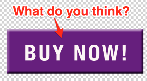
When was the last time you saw an ‘add to cart’, ‘register now’, or even a ‘sign in’ button that was purple?
The colour is very rarely used for CTA’s. We’ve tested them (to see why everyone avoids them) and discovered it’s because they don’t work. Our Purple CTA came in lowest of all colours tested!
Despite purple not having any psychological connection with food, it has been used to powerful effects in the chocolate niche, with brands like Cadbury and Milka using it to evoke decadence and luxury.
Purple is a great way to increase the perceived value of a product/service or brand, and should be used to do this, just don’t use it on pages that require urgency!
Most Suitable Industries/Products
- Luxury/high-end market
- Indulgent products
- Sophisticated/mature target market
Green

Psychology of Colour: Green’s Effects
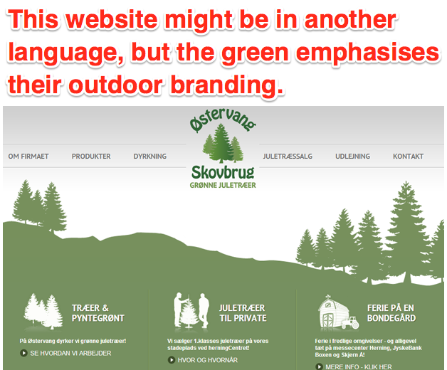
Green’s clearest and most obvious psychological link is with nature, the environment and the great outdoors.
This organic feel makes it a straight forward branding and marketing choice when promoting ethical and natural features.
Green is a calming and balancing influence on people, especially when using lighter or pastel shades like mint.
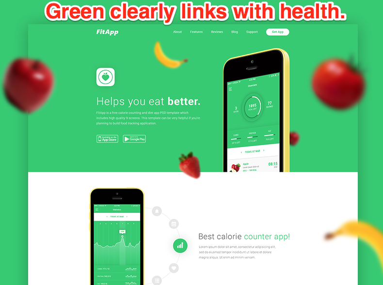
This secondary colour is also strongly associated with ‘Go’ signs, movement and growth, making it a firm favourite in any marketers toolbox.
Psychology of Colour: Green’s Uses
As mentioned earlier, green is widely used in CTA’s. It stands out and triggers that ‘go’ feeling. Whilst orange has come out on top in numerous split-tests we’ve performed, green is consistently high and sometimes beats it in terms of conversion.
If you’ve got a product that has any links with the environment, you should definitely use green. Studies have proven that environmental friendliness has become increasingly important in consumer’s buying decisions. Use it in your branding to emphasise this natural and ethical link.
Using GREEN in your branding is a great way to emphasise a natural and ethical link. Click To Tweet

Very few brands are brave enough to prominently feature green in their branding, if you want to stand out and can see a clear link between the psychological triggers and your product, click green for go.
Most Suitable Industries/Products
- ‘Green’ products
- Environmentally friendly
- Health and wellness
- Fitnes
Black and White
Neither primary or secondary colours, black and white are so crucial in marketing that they had to be included in this colour list.
Black

Psychology of Colour: Black’s Effects
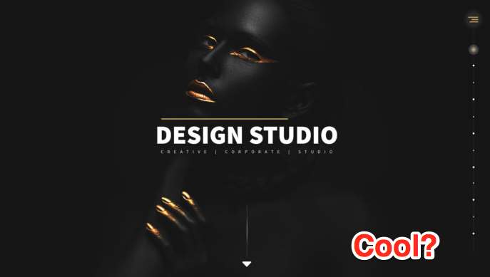
Black is the most prominent and powerful of all the colours. It’s almost always used as text, because it stands out so well on light backgrounds (like this one).
Despite the saying ‘black is the new black’, it’s actually increasing in popularity, particularly in marketing materials from some of the biggest brands in the world.

Its sophisticated, edgy and elegant feel make it the perfect choice for brands hoping to increase anticipation and give themselves the very elusive ‘cool’ factor.
Psychology of Colour: Black’s Uses
I’ve never seen a black CTA and cannot comment on whether they are effective because we’ve never tried them!
Black makes high-impact landing pages and marketing materials, particularly when it dominates the page, but it should be used sparingly.

Despite black being such a powerful colour, it doesn’t stand out as well as brighter colours in locations where there is a lot of competition for attention (newsfeeds, ads, etc.)
If you’re hoping to add elegance, mystery and sophistication use black against white on your website.
Most Suitable Industries/Products
- High-end products
- Tech
White
Psychology of Colour: White’s Effects
White pairs with anything and this is why it’s used on most designs. Look back through the images in this blog so far, how many of them use white as a background, or for text, icons and designs?
As a feature colour white creates a sense of cleanliness, minimalism and purity, making it a big favourite with brands hoping to give a modern crisp feel to their material.
White also evokes creativity, giving us the space to think (just like a blank page), and when used as a background, helps to draw eyes to the all-important page feature.

Psychology of Colour: White’s Uses
It’s tough to place white’s uses, because it depends what colours it’s used with.
One thing’s for sure, white doesn’t work as a CTA. A white button, on a white background wouldn’t stand out, draw attention or create any sort of urgency.
However, the majority of your websites and landing pages should prominently feature white. It decreases clutter and ensures that a visitor’s focus remains where you want it.

Most Suitable Industries/Products
- Creative
- Design
- Tech
Conclusion
Colours have almost immeasurable psychological effects, particularly in the digital world.
You can make a huge impact on the decisions of your visitors, prospects and customers purely by changing the predominant colour at key stages of your funnel.
Creating awareness, proving trustworthy during evaluation and converting visitors can all be increased just by making a colour change.
If you don’t already, I suggest going away and split testing the power of colours, particularly on your marketing materials and CTA’s. Use the advice in this guide to increase your numbers.
And remember, there are always exceptions to the rule. If you strongly believe that something will work in your industry, test it.
What do you think about the psychology of colours in marketing? Leave a comment or send us a message!
If you’re running ads, check out our ROAS Calculator to accurately estimate your advertising break even point before even starting you campaign, or learn more about Instagram Hashtags!


8 Responses
This is a very well written post. I appreciate the writer for the way the topic attracted my attention. I loved reading every bit of it!
I agree with the impact of colors on consumer psychology. But, we cannot generalize this for the different colors. I believe that everyone has a different preference for colors.
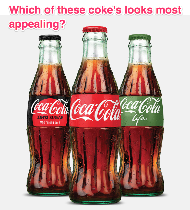
Let me use an example to elaborate it further. I liked the Coca-Cola bottle with a Green label. It caught my attention as I love this color. It was standing apart in contrast with the background of the liquid in the bottle. And, Hallmark is the name we all grew up with. We were attracted by their product. Even if they change the colors of their Logo, we would continue to buy their products, won’t we?
Similarly, websites are more attractive in a white background. And, Google is the perfect example of this!
I can’t help think: what about grey? I imagine it is not used much because it is dreary. And I suppose one could start fragmenting to all those tertiary colors (pink, brown, magenta, mauve, etc). I’m not asking about those (maybe pink and brown, IDK).
Anyway, GREAT article. Thank you so much.
Jason
Hey Jason, thanks for the comment.
Great question, I haven’t used grey in marketing before as it doesn’t stand out and i can’t imagine it inspiring action. In my opinion, it is quite dreary (as you mentioned), but it can also be used to impart sophistication.
A great read, very well written
Thank you Natasha!
Hi Josh,
This is a refreshing read. Considering that this an obvious but often neglected part of marketing, it’s great that you’ve drawn attention to the psychological impact of colours.
It’s also a challenge to always think of colours and their applications before adding them to landing pages and other campaigns.
Hi Olumide,
Thanks for the comment! Yes, colour is often overlooked, which is surprising given it’s psychological power.
A lot depends on the industry and the objective of the marketing materials, but when you are used to creating campaigns, colour choice can become second-nature.
This website really has all of the info I needed concerning
this subject and didn’t know who to ask.