Push the button…
…that’s what you’re praying every time you create a new digital offer.
A call to action, more commonly known as a CTA, is a ‘button’ or link that tells prospects to move forward and accept your proposal.
If you’ve always looked at the CTA as a simple formality, never tested it or haven’t ever put any thought into optimising it, you’re in the right place.
The call to action is a crucial element of any offer and its strength (or weakness) can literally make or break your campaign.
In this guide we’re going to take a closer look at the power of the CTA, highlighting 7 essential features that require tracking, analysis and optimisation.
Whilst this guide will give you a ton of optimisation and test ideas, there are very few universal rules that work for all industries. I will give you examples and explain why they work, but in order for you to achieve your highest converting CTA button, you’re going to have to take these tips and put them to work…
…your target market is specific to your business. You must find what works for them.
All clear?
Let’s get into this:
Contents
Shape/3D
I’m going to kick these tips off with one of my pet peeves…
You might notice that I’ve not only mentioned the ‘shape’ of your CTA button in the title (above) and that’s because I absolutely hate CTA’s (and buying buttons) that are flat and 2-dimensional.
A button that has no depth (or depression shading) doesn’t inspire much temptation for it to be pressed. Think about the psychology of pressing a button, a flat rectangle doesn’t create the same sort of desire as a 3D button that actually depresses when clicked.
So, my first tip is this…make sure your buttons are 3D (or have some sort of shading that makes them look like they have depth).
For example, Amazon use 3D CTA buying buttons that change shade when a mouse hovers over them. If the world’s biggest retailers are doing it, we can be pretty certain that it works.

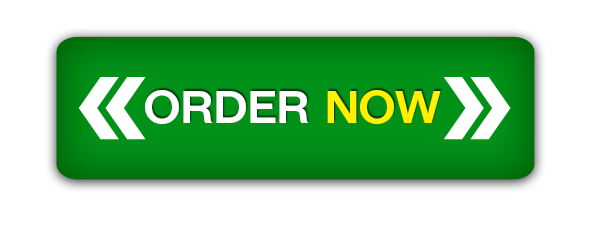
Before I move on, I’d like to quickly cover shape. The favourite of nearly any digital business selling online is the rectangle.
Buyers, subscribers and offer accepters are tuned into rectangular buttons as clear CTA’s. It’s important that you follow suit and stick to this protocol.
However, one thing you should try to avoid are rectangular buying buttons with pointed (90 degree) angle corners.
Sharp corners are thought to point away from the button and draw the attention of the prospect away from your CTA. A curved cornered button draws focus to its centre.

Go for a 3D rectangle with curved corners and you’re off to a great start.
Exciting/Emotive Text
If you aren’t excited about a prospect clicking on your call-to-action, then why should they be?
The best way to share this feeling is by using emotive (and exciting) language in your CTA. This doesn’t mean writing long-winded copy or using tons of adjectives.
A great CTA is short (8 words max) but is still able to elicit the emotion you require in a prospect. Do this by highlighting a key benefit or stating the reason for your offer (e.g. price reduction).

This tip can change CTA’s from simple, ‘Book Now’ commands to (much more exciting) ‘Book Your Dream Holiday Now!’ or ‘Book Now for 25% Off!’.
BTW: Both of these edited CTA’s have exclamation marks at the end (!), this tiny addition can create much more excitement, enthusiasm and emotion in your copy.
Use this tip in your CTA copy and you’ll remind prospects of your key offer values at the crucial moment.
Clear Commands
Your CTA must include a strong and clear verb.
BTW: a verb is an action word.
Remember, you don’t have loads of space to write long-winded copy. If you really want to convert, you must be direct, clear and concise with your use of verbs in the CTA.
This means using words like ‘Subscribe’, ‘Buy’, ‘Order’ or ‘Download’. Verbs like these tell the prospect exactly what will happen when they click the button.
‘Get’ is another verb that is commonly used and it can have powerful effects, especially when tied together with emotive language. This tells the prospect that they will receive something when they accept the offer.
‘Get’ is a versatile verb that should be tested against weaker commands like ‘Request’ or ‘Find’. For example, if I was encouraging prospects to read more about the benefits and specifications of a product I was selling, I’d use ‘Get More Info’ as a CTA rather than ‘Find Out More’. It’s more direct, clearer and offers more to a prospect.

Colour
Colours affect the decision making process, trigger emotions and can have startling effects on your conversion rates.
Any marketer who has sold online will have (or at least should have) tested CTA button colours and will understand its importance.
There is a commonly held belief that buying buttons (and CTA’s) should be green, as it triggers psychological feelings of ‘Go’ or moving forwards. Whilst this is (partially) true, we have tested green against others and it doesn’t always come out on top.

In fact, in a lot of the tests we have performed (for ourselves and clients) orange has actually been the top performer.
And we aren’t the only digital marketers to have noticed this, Amazon also use orange as the trademark colour of their buying buttons.
When creating your CTA, make sure you perform split tests using at least 2 colours. If you’d like to learn more about colours in marketing and the best options for your CTA, check out our guide to The Psychology of Colour in Marketing.
And remember, there is no hard and fast rule for CTA colours. A lot will depend on the preference of your target market and the congruency of your CTA and branding colours.
FOMO
Regular readers will know how much I love FOMO. In my opinion, where there’s an offer, there’s an opportunity to create FOMO.
FOMO literally stands for ‘fear of missing out’ and it’s used to describe the increase in importance of something (usually an offer or product) when a prospect feels like they might miss out on a opportunity.
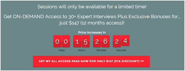
It is usually incited by running ‘limited time’ promotions or making prospects aware of your stocks levels. If you’ve ever seen a product page that says ‘Only 3 in Stock’ besides the CTA button, you’ll have noticed a FOMO marketing tactic.
FOMO is a powerful motivator and if you’re running a promotion/offer, you must consider using it. However, if you’re planning to use it in your CTA text, be careful not to combine it with the emotive/exciting text tip (explained earlier).
FOMO uses negative connotations of threat (literally, the fear of missing out) to encourage prospects to make an immediate decision, whereas exciting copy works on positivity.
Being honest is also crucially important. Do not use FOMO in a dishonest way, e.g. telling prospects you only have 1 product left when there are actually 1000’s. People aren’t stupid, and all it takes is for one person to notice and spread the word.
Try a FOMO CTA like ‘Buy Now! 50% Off Today Only!’, or ‘Order Now! We’re Almost Out of Stock!’ to harness this powerful psychological CTA tip.
Numbers
Numbers draw massive attention and are easily picked out by prospects when they’re scanning landing/buying pages.
Most prospects will actively search for numbers when they enter a landing page (particularly if they’re considering buying). This is because price is crucial in the buying process.
Using numbers can immediately draw a prospect’s eye to your CTA button, which is an amazing first step in encouraging them to click.
Although price is incredibly important to prospects, only use it in your CTA if it states that it’s a saving. Prices can act as a psychological barrier, reminding them that by clicking the link they’ll have to part with their hard earned money.
Percentages are a safe bet (especially if you’re running a promotional offer) or social proof numbers (e.g. Join 10,000 other…). Both of these tactics will draw attention and aid the performance of your call to action.
Split Test
It’s at this point (our very last) that I’d like to remind you that what works for one business, won’t necessarily work for yours. This is why it’s so important for you to split test.
Trust me, you’ll be shocked at the difference a small change to your CTA can have on your conversion rates.
In order for you to find your highest performing button, you should run at least two different CTA’s against each other. If you don’t have the software (or budget to buy the software) to test, alternate in set timeframes and track the results.
When you find a winner, test it again and again, until you find your optimum.
Conclusion

Those are my top 7 tips for CTA’s.
Over the years, we’ve performed hundreds of tests and ran countless campaigns on different split tests and to this day, we’re still (occasionally) surprised by the results.
The digital world is always evolving and what worked yesterday, doesn’t always carry forward.
Testing a CTA doesn’t take a lot of time, imagination or resources. So do it!
Focus on your target market and the strongest elements of your offer and you can’t go wrong.