Crafting a magical, mystical, money-making landing page is a fine art.
Within this make-or-break webpage you’ve got elements of psychology, design, sales and marketing. Go too hard on one of these concepts, and you’ll lose, ignore one of them and you’ll lose again.
Like I said, fine art.
If you’re a regular Einstein Marketer reader, you’ll know exactly how to drive people to your landing page. We’ve been generous in that regard, but, we haven’t shared anything about landing pages…
…until now.
As an agency we build landing pages that convert at 40% plus. So, it’s safe to say that we’ve perfected the craft. In this guide, I’m going to run through a few landing pages (we’ve built for clients) that smash it, and detail 6 crucial things that your landing pages need now.
That’s enough conjecture. Let’s break out of the shadow-boxing and throw some knock-out punches:

Landing Page Must-Have #1: Value
The most elegantly designed, optimised and psychologically perfected landing page WILL NOT CONVERT if there is no value in the proposition.
It absolutely must be our first stop in this 6 station ride.
Just asking for a name, email and contact number in exchange for weekly updates, or a downloadable PDF isn’t good enough! In fact, it’s been done so many times that people are bored of it. They’ve seen it a thousand times, and they know that by taking the offer, they’re going to be inundated with marketing emails…
…and, when it comes to balance the value of the offer, these bad memories trigger negative emotions, and guess what? The value of your offer does not convert.
If you’re using a landing page to capture leads (or gain entry-level customers), you must focus on your target market’s wants and needs and offer them something that’s much more valuable (to them) than the price they’re paying.
Look at it like this, which of these offers has more chance of converting:
Offer #1: Information about a pain point that is readily available elsewhere and is easily fixed.
Offer #2: Information about a pain point that can’t be found elsewhere and has been a constant problem.
Hopefully, (like your target market) you value Offer #2 higher. And that’s because it has more perceived value. Offer #1 is worth nothing in the eyes of your prospects, whilst Offer #2 is worth money!
Let’s take a look at a landing page we built to collect leads for a client:

When a prospect lands on this page, they can see masses of value. For starters, the book is a Sunday Times Best Seller (we marketed the book, we’ll explain how we did that another time), it’s on sale on Amazon for £7.99 plus shipping, and the audio version is only available for paid members of apps like Audible.
In other words, the information in this book was only available if a prospect paid for it, but now we’re offering it for FREE, it’s perceived value is HIGHER than our offer value. And when perceived value is higher than cost, conversion rates go through the roof!
Read that last sentence again, and apply it to every single one of your landing page offers.
Landing Page Must-Have #2: Navigation (or Lack of)
On a normal web page we have to work hard for a visitor to navigate through our content to converting pages, but on our landing pages, the last thing we want is navigation elsewhere. The only place we want them to go, is through our offer.
That’s why, any landing page you create must not have navigation options anywhere on the page, especially at the top!
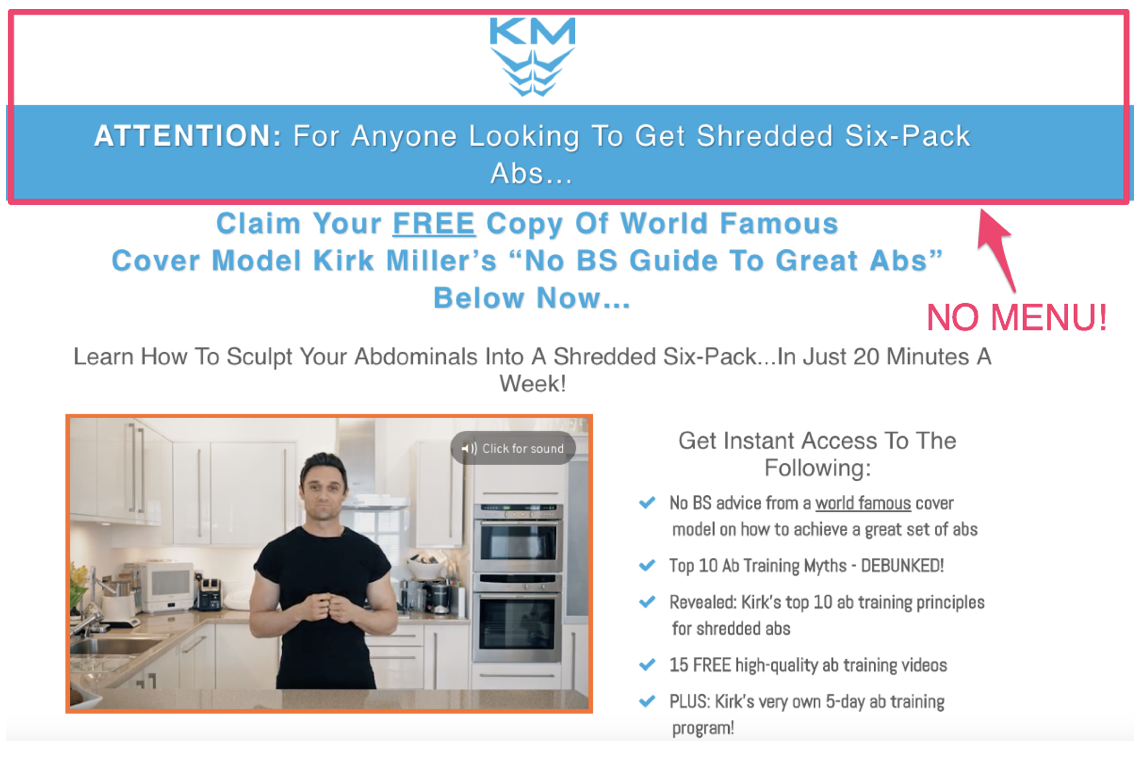
We want to give visitors two options, take the offer or leave, and it’s our job to convince them not to leave (more on this later).
This tip might sound simple and against everything you’ve ever learnt in web design school, but it’s massive.
Some visitors might be on the fence about taking your offer, so instead of seeing the content on the landing page (that is there to convert), they go back through other pieces of content on your site, and enter a completely different level of your funnel. THIS IS THE LAST THING WE WANT!
Your landing page is optimised to convert, your website isn’t. Don’t lose prospects because you’re worried about your bounce or exit rate. Those metrics are irrelevant here.
Make the menu disappear and you’ll see higher conversions.
Landing Page Must-Have #3: The Right Tools
You might’ve heard the expression, ‘a bad workman always blames his tools’, this section of our guide is an example of a good workman thanking his tools.
Whether you’re selling online or capturing leads, you’re going to need multiple landing pages. So, it’s important that they’re easy to construct and always optimised to convert.
That’s why we use the right tool, ClickFunnels.
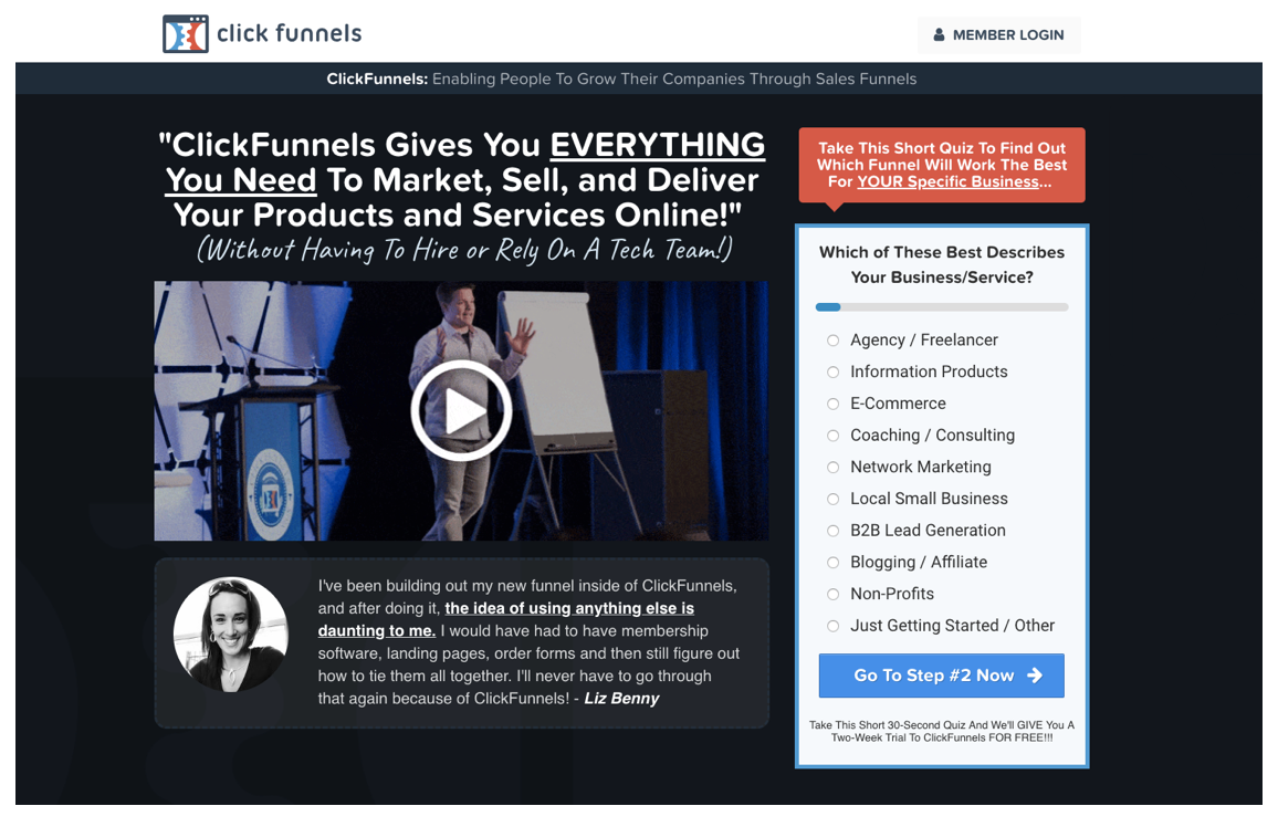
Before we go any further, I need to make sure you know this isn’t a sales pitch for the software. There are loads of different landing page and funnel builders, we use ClickFunnels because we think it’s the best. However, you might find something else that works for you.
The reason we rate ClickFunnels so highly is because it does tons of stuff that a normal web builder doesn’t, and they’re all primed around converting as many visitors as possible!
For starters, the software tracks data that’s crucial for optimisation and allows us to create split-tests so we can easily compare pages. This means we can compare copy, images, videos, formats, CTA’s, basically every element on the page, until we’ve got the highest converting formula. ClickFunnels automatically splits your traffic, so half see your control page (original design) and the other see the test. If you were to try this with a regular web builder, you’d have to build two completely different sites from scratch!
It’s also super-quick and easy to build landing pages. The software comes with templates that are already optimised. They use data from all of their customers’ highest converting pages to recommend templates that work.
But, like I said, there are many other companies who offer similar services. Look around and find the one that’s best for you.
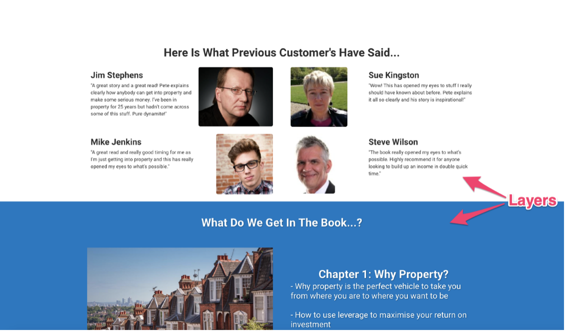
Landing Page Must-Have #4: Social Proof
Every landing page you build must include social proof. It’s the highest converting form of content, and without it, your conversion rates will definitely fall.
You can use social proof in any form, as long as it’s easy to understand, relates to your target audience and is well placed within your page.
We’ve previously used testimonials, reviews, case studies, polls, social media metrics and comments, and they all work. The key thing to remember is who your target market are. Think about what form of content they’d find the most trust in, and…
…only use genuine social proof! If you try to cheat or lie to your prospects, you will be found out, especially if you use generic looking customer photos that you’ve found on Google.
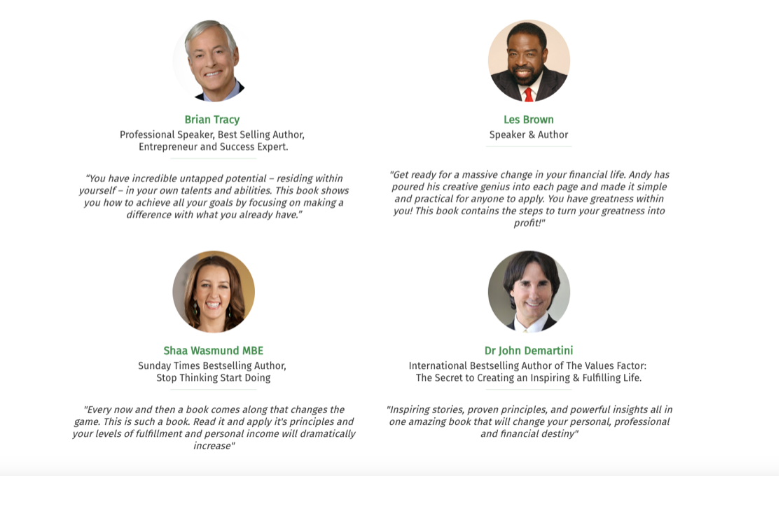
If you can get a testimonial from a respected name, or somebody who is well-known to your audience, it will increase the levels social proof further. On the audiobook landing page (we showed you earlier), we used testimonials from people who are well-known to our clients audience, greatly increasing social proof:
But, don’t worry if you’re not at this stage yet. Social proof works just as well when it directly relates to your target audience:
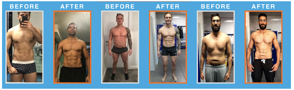
A prospect who is really into fitness but feels unable to achieve their aims, will relate to the photos above, creating social proof.
Landing Page Must-Have #5: Video (over Images)
I’ve seen too many landing pages without video or images. Equally as annoying are pages with tiny, blurry or irrelevant images.
This sounds really simple, but it’s a common error.
But, before I reel off the obvious reasons for having them, I need you to stop thinking of visuals as videos OR images. Instead, think of them as videos first and images second.
In other words, only use images if you can’t get a video.
Videos are the hottest (and fastest growing) form of content. They give you the opportunity to visually impress like an image, but also engage, inform and entertain like a written piece of content. This combination has seen their popularity soar in recent years.
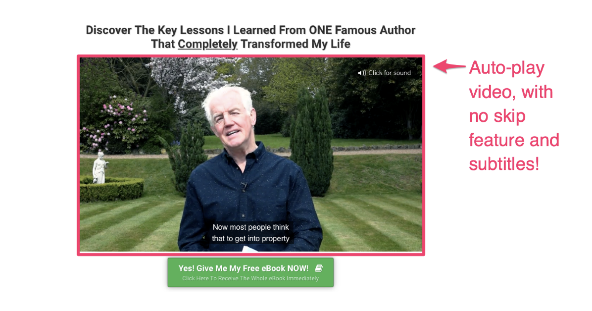
Use a video format that auto-plays, and try to use clear subtitles. This will immediately grab the attention of your visitors, giving your video the best chance at converting.
Landing Page Must-Have #6: Simplicity
Last but not least, a nod towards design.
A landing page should be clear, simple and direct in order to convert at its optimum level. Look back at all the examples in this guide, how many have loads of elements fighting for attention? How many are overloaded with text? Or colourful designs?
9 times out of 10, I’d recommend using a plain white background, with your branding colour set against it. Make sure there is no chance of confusion, or lack of direction on the page and always gear your pages so attention is directed at your video.
Use the text to compliment and convert those who need a little extra persuasion. And layer your page, so it handles objections and shows off the key selling points of your product.
There’s no need to squeeze fifty things in at the top of the page, or have a landing page that requires a five minute scroll to reach the bottom. Pick out the most common objections, and your strongest selling points and go with them, one after the other.
Conclusion
If you’re new to landing pages, or have several that convert at low levels, I’d suggest creating a checklist of these 6 fundamental elements.
These are the basics, you must get these correct before chasing the extra 1%’s.
And don’t worry if you’re already set with these elements, or you’re looking for more detail to supercharge your foundations…
…because we’ve got loads more landing page tips and tricks coming soon.
Keep an eye out.
What did you think of this guide? Have you created landing pages that don’t convert? Leave a comment, we’d love to hear your opinion!

If you’d like to learn more customer converting tactics, check out our Ultimate Guide to Conversion Funnels.