As the world’s companies make the move from the high streets to the internet, CRO (conversion rate optimisation) is at the forefront of every manager and business owner’s mind.
As we know, CRO is the art of turning visitors into buyers and, there are endless blogs and articles out there which will claim to show you how to do this. So, first things first, what do we mean by conversion rate optimisation (CRO)?
In layman’s terms, this is simply the process of turning website visitors into website buyers or subscribers.
CRO involves gaining an understanding of the people who visit your site, what they do when they get there and, most importantly, what, if anything stops them from completing a certain action such as buying a product or signing up to a newsletter.
A conversion rate is calculated by dividing the number of times a user completes an action by your site traffic figure.
Contents
The 2 Types of Conversions
Macro Conversions
Some examples of macro conversions include convincing a website visitor to:
- Buy a product from your website
- Request a quote from your website
- Subscribe to a service via your website
Micro Conversions
Some examples of micro conversions include convincing a website visitor to:
- Sign up to your email list
- Create an account via your website
- Add a product to their shopping cart

There are numerous ways of turning those visitors into action-takers and, we’re going to take a look at some of them in this article.
A lot of CRO articles will wax lyrical about ‘internalising your goals’ and ‘optimising your sales funnel’ in order to get those customers clicking through to the checkout.
These methods include lots of complex calculations and the use of expensive tools in order to gain the results that you’re after for your CRO.
Some businesses, however, choose to move to their own beat and, we’ve picked out a few of the best of these:
Google’s Great 50 Shades Of Blue Experiment
Some years back, Google launched ads for Gmail which meant that users would see advertising at the side of their screens containing links similar to those on Google searches.
So far, so simple, however, an eagle eyed employee noticed that the search links and the ad links appeared in slightly different shades of blue. So what? Blue is blue, right? Apparently not.
Google then decided to run a ‘1% experiment’ whereby 1% of Google users were shown one shade of blue and, another 1% were shown a different hue.
The internet giant then launched forty (count ‘em) other blue-related experiments to find out which shade of blue customers liked best.
As it turned out, those fussy Google users preferred a ‘slightly purpler’ shade of blue which Google then implemented across its entire operation. Incredible as it may seem, this seemingly small change netted Google an additional $200 million per year in advertising revenue.
BTW: You Can discover more about the implications of colour in our Complete Guide to the Psychology of Colour in Marketing.
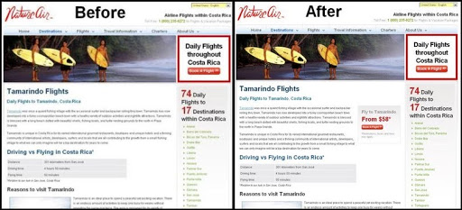
Nature Air’s CTA Experiment
Costa Rican airline, Nature Air, proved that location really does matter with its recent landing page experiment.
Concerned that its landing pages weren’t converting as well as it would have liked, the company decided to run A/B testing on the location of the CTA (call to action).
As a result, the airline decided to move the CTA just a few millimetres – from just above the fold to just below – and, as a result, ended up flying high with a conversion increase of 591%!
Incredible but true, this teeny tiny change netted big results for Nature Air and, the lesson here is test, test and then test some more!
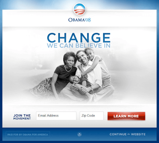
A Presidential Experiment
In 2007, Barack Obama was struggling in the polls and, was an unknown in many parts of the USA.
For the 2008 presidential campaign, his team knew that they would have to pull something pretty special out of the bag and, so, the campaign’s Director of Analytics decided to run one simple experiment.
The experiment worked on the basis that each and every website visitor represented an opportunity and, so, it was decided that the answer was A/B testing on the Media section of the site and, on the call to action button.
Using Google Website Optimizer, the campaign tested 24 combinations of the following button options:
- Join Us Now
- Learn More
- Sign Up Now
- Sign Up
The results were then tracked to see which combination resulted in the highest sign up rate. There were a total of 310,382 visitors which meant that each variation was viewed by around 13,000 people.
What happened?
There was a clear winner in the campaign – ‘Combination 11’ which used the ‘Learn More’ button along with an image of the Obama family.
This was a clear cut example of successful conversion – and one which saw Obama taking the top job in the United States of America.
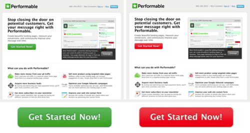
Performable Pushes The Right Buttons
Just as Google boosted its CRO with a link colour change, Performable (now Hubspot) benefited from the same principle with its home page CTA button.
Recognising that different colours evoke different emotions, Performable experimented with green and red buttons for its home page.
It was discovered that red, which is often seen as an ‘action’ colour, was the most effective and, subsequently, the company saw a conversion increase of 21%.
It’s hard to overstate the importance of colour and size within an advert or piece of content. Human beings are programmed to have an emotional reaction to such things and, it’s well worth doing your research to make sure that you get this right.
Doctor Footcare’s Cure For Low Conversions
When looking for an overhaul of how its website was performing, Doctor Footcare made nine changes to its checkout page.
Although some of the changes made proved to be a foot in the mouth, one surprising change stood out in terms of positive results.
When Doctor Footcare removed the coupon code from its checkout page, it saw a conversion rate increase of 6.5%.
It was discovered that the perception of the coupon code’s presence was that it cheapened the product and made customers question whether there were more high quality / low price alternatives out there.

Bradley Spencer Removes Trust For Improved CRO
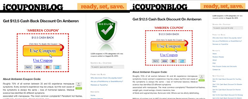
You wouldn’t think that you could increase CRO by removing trust but, that’s exactly what Bradley Spencer did with its iCoupon Blog.
The original image that the blog used featured a large green ‘Secure’ shield which aimed to improve customer confidence.
Strangely, it did the exact opposite and, after removing the shield, the business saw increased CRO at a whopping 400% !
The simple reason for this is that the shouty ‘trust us’ badge immediately made visitors suspicious – perhaps because they feel that trust should be an integral part of any business.
These are some great examples of how brands have performed CRO but, getting to grips with this needn’t be expensive or overly complicated. You can significantly improve your site’s CRO by paying attention to a few simple things:
Clickable PPC Ads
We all know that PPC ads can really help to increase site traffic and, that it’s vital to write an ad which is engaging and compels potential customers to click through to your site.
This is, unfortunately, the point at which a lot of your potential customers head for the exit.
The problem ? A lot of brands make the mistake of spending time and money on their PPC ads, only to let this go to waste by sending customers to their site’s home page.

When looking to convert visitors into customers, it’s vital that the content of your landing page mirrors that of your ad – when a potential customer clicks on an ad, he or she expects to be taken to a place which contains the information that interested them in the first place.
Before creating your ads, always make sure that you have a killer landing page which will help send the customer sailing through to the checkout.
Site Useability
It may be stating the obvious but, if your site navigation is overly complicated or experiences regular technical issues, this won’t help your CRO.
These days, website visitors have an incredibly short attention span and, if they can’t get where they’re going quickly and easily, they’ll most likely give up and go elsewhere.
Always perform regular health checks on your website and, if necessary, hire a professional to advise on the user experience of your site.
Bribe Your Customers
Everybody loves a freebie or a discount and, offering an incentive is a really good way of sealing the deal with your conversions.
Make sure that you mention your incentive at every stage of your call to action in order to keep the deal at the forefront of the potential customer’s mind.
“Users on the site show high interest, predictable patterns showing what they are interested in, behaviour appropriate to what would be expected for where they are in the research and purchase cycle. Tim Stewart MD TRS Digital from the interview “
Conclusion
If there’s one thing that I’ve learned from these examples its that testing is everything.
Before blowing the marketing budget on a lot of fancy SEO services, try making a few small changes – they may just convert into big benefits!
Want more marketing advice, strategies and tactics? Check out one of our most popular marketing guides:
- Priming in Marketing: Advertising Psychology 101
- The Complete Guide to Building Winning Facebook Ads (From Start to Finish)
- How (and How Not) to Use Instagram Hashtags in 2020