User Experience (otherwise known as UX) is one of digital marketing’s hottest buzzwords…
…but this isn’t a fad or label used for monetisation. It’s a massive issue for businesses.
A poor user experience can have a startling effect on your website’s traffic, your target market’s opinion of your brand and your business’ conversions. This is why it’s crucial that you take notice.
In order for you to truly understand the importance of digital UX, you must see it as your website’s version of pre-sale customer service.
Contents
What is User Experience?
UX is literally how your visitors interact with your website and their opinions on its quality. [click_to_tweet tweet=”A poor UX can stop visitors purchasing, signing up, visiting again and in extreme cases, lead to poor word of mouth (both online and offline) between your prospective visitors. 🗣😡🤦♂️” quote=”A poor UX can stop visitors purchasing, signing up, visiting again and in extreme cases, lead to poor word of mouth (both online and offline) between your prospective visitors. 🗣😡🤦♂️” theme=”style3″]
User experience should be a clear and important part of your digital strategy, and in the rest of this guide I will be demonstrating what user experience factors you should avoid and how you can improve your UX to maximise digital performance (including a free 4 page UX checklist!).

Let’s get into it…
User Experience: The Basics
UX and Load Speed
Think your load speed is good? Have you even checked?
The world is speeding up and people aren’t prepared to wait anymore, making load speed fundamental to user experience.
47% of people expect your site to load within 2 seconds, and for EVERY additional second, page views decrease by 11%, and conversions by 7% (Source: Quantam Dynamix). [click_to_tweet tweet=”When it comes to load speed, every second costs money! ⏰💵” quote=”When it comes to load speed, every second costs money! ⏰💵” theme=”style3″]
Google rank fast sites higher than slow ones. This is a clear signal of intent by the super-fast search engine and a demonstration of how highly they regard user experience. As the world’s most popular website, they’re probably a good example to follow.
But, although Google penalise sites with slow load speeds, they also offer help. They’ve created tools for people who are actively trying to improve their websites.
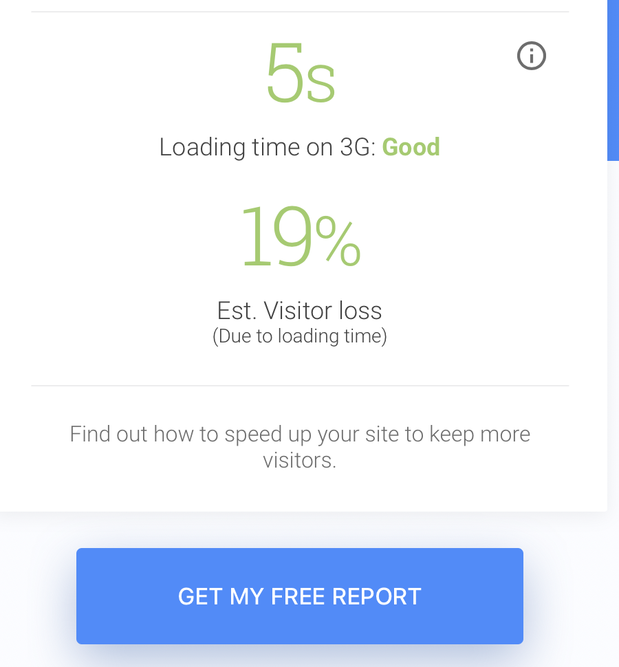
Their ‘Test My Site’ tool reveals mobile load time, estimated visitor losses (due to load time), industry comparisons and a report with instructions on how to improve.

And their ‘Make the Web Faster’ tool, analyses websites page-speed score and offers suggestions about how to speed it up and therefore improve user experience.

Bad UX
- Not Regularly checking load speed times
- Not optimising site for load speed (using free report or tools)
- A website with over 3 second load time
- Not optimised for Mobile (more on this later)
Good UX
- Regular load speed checks
- Closely following updates to relevant load-speed services
- Implementing report advice
- Optimised for Mobile
- Site that loads (first bytes) in under two seconds
- Instant caching for return visitors
BTW: Scroll to the end of this guide to get the free UX Checklist!
UX and Website Navigation
If you want users to buy, spend loads of time on your site and enjoy their experience, you have to make it easy to navigate.
There are very few things more irritating than having to work to find something within a website. [click_to_tweet tweet=”All webmasters must have a clear and concise roadmap of directions, that any web user can understand. 🗺✅” quote=”All webmasters must have a clear and concise roadmap of directions, that any web user can understand. 🗺✅” theme=”style3″]
A menu bar should appear on every page, and always be placed either horizontally along the top of the site, or down the left-hand side. Menu’s that are placed in the centre of pages, on the right-hand side, or the bottom, are hard for users to find and incredibly irritating for our conditioned mouse behaviour.

Poor navigation makes people work and work makes for a bad user experience.
You should also have zero clutter or loud designs fighting for attention. Content will do the attention-grabbing work, not crazy designs or eye-burning flashes of colour.
The success of your website’s navigation comes down to speed and clarity. How many clicks does it take for a user to reach a buying page? Or an About page? Or a blog?

Simple and clear will always provide a better user experience than clever and complicated.
Bad UX
- Poorly positioned menu or no menu at all
- Logos not linked to homepage
- Complicated design
- 4 or more clicks to reach anywhere on your site.
- Broken links
- No filter or sort options
- Irrelevant suggested pages EVERYWHERE
- Complicated (buying) processes
- Style over user experience
- Not optimised for mobile
Good UX
- Internal search bar
- Menu always present at top of page
- Optimised for mobile
- Any page can be reached in 3 CLICKS or less
- Clear design
- Simple CTA’s
- All links regularly checked and working
- Logos and images are linked to relevant pages
- Filter and sort options on EVERY list or results page
UX and Security
A week doesn’t go by without data protection hitting the headlines. The public are worried about their personal information and the security that websites offer.
This makes it a massive must for anybody with a website. It doesn’t matter if you’re a B2B seller, a blog, dropshipper, service provider, influencer, magazine, publication, tool, software developer, B2C trader…
…your website must have security in place to allow visitors to have a good user experience.

People have become wise to data collection methods and are more than aware of the dangers.
In 2018 (it feels like ages ago now) we saw the GDPR law change and the scandal surrounding Cambridge Analytica and Facebook, and since then we’ve seen tons of data scandals hit the headlines.
Everyone wants to know they’re safe. According to C.A Security Council, only 3% of people would give their credit card information on a website without the padlock icon, and 18% of shoppers abandon their shopping cart citing trust as their sole reason.
Chrome have also updated their browser, so sites running under the unsecure HTTP are now labelled ‘Not Secure’ in the URL bar. And with 60.98% of the browser market, it’s crucial that webmasters take notice. This ‘not secure’ sign immediately makes us feel threatened, creating a bad user experience.

Bad UX
- HTTP
- No security
- Not actively showing security labels to visitors
- No data privacy policy
Good UX
- HTTPS
- Security installed
- Security badges shown on buying/commitment pages
- Clear and easy to find data policy
BTW: Scroll to the end of this guide to get the free UX Checklist!
UX and Website Updates
If you’ve built a website and just left it, you’re already creating a bad user experience through laziness.
Visitors will return to your site if they like it and it fulfils their needs, but they won’t keep coming back if you aren’t frequently updating the site or posting new content.
Businesses will already know the importance of content marketing and should regularly create new content, whether that be images, blogs, audios or videos.

Publishing frequent content will drive new visitors and increase the loyalty rate of existing users, as well as showing prospects that your business is up-to-date, still operating and responsive.
The same can be said about your website’s design. You should update or redesign your site every 2-3 years AT MOST to keep it fresh and exciting for your audience.

Bad UX
- Design older than 3 years
- Never updated site
- No dedicated pages for new content
- No promotion of new content
- Complete lack of effort towards content marketing
Good UX
- 1+ pieces of content published every week
- Dedicated and easily navigated pages for content
- Frequently post updates on social media
- Promote new content
- Update products/pages/services regularly
- Up-to-date design
- Testing, analysing and implementing results from new content
UX and Sales/Lead Capture
Would you go back to a shop where you were constantly harassed to buy or exchange your contact details?
The same applies to websites.
Timed (or instant) pop-ups might grab a few extra leads, but really, they’re doing a lot more harm than good, especially when they’re irrelevant (to the webpage), intrusive or irritating.

We use exit pop-ups to maximise the effects of lead capture, without negatively affecting the user experience. Our exit pops are relevant to our audience (and website content) and aid the user experience by giving away super-valuable free eBooks (as lead magnets).
BTW: An exit pop-up appears when a visitor moves their mouse towards the browser toolbar at the top of the screen.
Giving away free valuable stuff to your audience (in the form of lead magnets) is a lot less annoying than constantly asking them to buy things and part with their hard-earned money. A free thing can be the first step on your value ladder and marketing funnel, which will help maximise customer value and increase conversion rates.
Bad UX
- Pop-ups, especially the overly-demanding, irrelevant, zero-personality, unclear, immediate kind.
- Too many native ads
- Overbearing ads everywhere
- Poorly placed ads
Good UX
- 0 ads
- If using ads, relevant, appropriate and not over bearing
- No pop-ups (or exit pop-ups only)
- Relevant CTA’s placed in appropriate content
UX and Website Design
A website should be functional before fashionable, no matter what it does. An easy to use website makes for a good user experience.

Many of the most popular websites in the world use incredibly minimalistic designs, and there’s good reason for it: Minimalism reduces confusion, intrusion and irritation.
Websites with the most user-friendly designs stick to 1 or 2 main colours (in addition to lots of white), go for an easy to read font and place images only where they are relevant.
Design tends to be one of the most contentious points in web building, because owners always want their site to be stylistically beautiful. Unfortunately, attractive doesn’t always make for a good UX.

Another UX killer are auto-play videos (or audio). We may have thought this was amazing a few years ago, but now it’s irritating, slows load speeds and is intrusive. If users want to play a video or audio on your site, they’ll press the play button.
Bad UX
- Unclear font
- Flashing images/buttons
- Auto-play video/audio
- Too many colours
- Clashing colours
- Too many images
- Poorly formatted images
Good UX
- Simple
- Easy to read font
- 1-2 main colours
- No auto-playing features
- Relevant images placed in relevant places
BTW: Scroll to the end of this guide to get the free UX Checklist!
UX and Mobile Optimisation
Mobile is now the most popular device for internet users, with over 53% of the world using mobile to browse the web. This is 9% more than desktop users who were just shy of a 44% share, according to Statcounter (December 2019).
You simply must have you site optimised for mobile if you want the majority of internet users to have a good user experience whilst visiting your domain.
Source: StatCounter Global Stats – Platform Comparison Market Share
If your site is not optimised for mobile, you’re leaving a lot of business/visitors and interactions on the table.
When thinking about design avoid Flash (the plugin often doesn’t work on mobile), delete pop-ups and make all buttons LARGE enough to be pressed with a fingertip.
It’s also very important that your site is optimised for speed on mobile. As I touched on earlier, Google ranks sites with fast loading speeds higher on search. You should use the ‘Test My Site’ tool (FREE from Google) to receive a FREE REPORT and suggestions for improvement.
BTW: We use AMP on our website pages so our mobile pages load instantly when visitors arrive from Google. Find out more in our guide to AMP.
Navigation is a massive factor in mobile UX too. Ensure that all menus are clearly marked, available on every page and reduced in size from your desktop version. Create a dropdown menu with additional (less used) options. Three horizontal lines is a sleek universally recognised design that can’t go wrong.
Bad UX
- Design doesn’t function on mobile
- Slow loading speeds
- Tiny buttons and links
- Flash player
- Pop-ups
- No optimisation efforts
Good UX
- Big focus on mobile optimisation
- Regular reports and implementation of suggestions
- Fast loading speeds
- Clickable buttons and links
- Easy to navigate touchscreen format
- All website updates and content is checked on mobile before being published
Other Factors
There are many factors that make for a good user experience (as you might’ve noticed). I won’t be able to cover absolutely everything (we’ll be here all day), but if you’ve got the basics correct, here are a few additional points that can make a big difference.
UX and Quality Content
Effort should be put into everything published on your site. If you don’t invest time and energy into the quality of your content, why should anybody visit it? Use a variety of formats to hit a broader audience and improve user experience.

When visitors learn something new or are entertained with your content, they’re much more likely to remember their experience in a positive light. Put in the time and you’ll get the rewards.
Bad UX
- Rehashed opinions
- Copied content
- Sloppy, poorly produced work
- No variety
- No strategy
Good UX
- Clear and effective strategy
- Original work
- In-depth
- Entertaining or educational
- Video, audio, written and images used
- Well-researched and effective
- Created with the audience’s needs in mind
UX and Social Media
Does your website have any links to social networks?
Social badges are easily recognisable and help promote your presence on social networks. They also provide social proof, proving how popular your stuff is with the rest of your market and allow your visitors to share your content!

Your social media profiles should be filled out with as much information as possible. This makes you appear much more transparent and authentic- making a massive difference to your trustworthiness and thus, improving user experience.
You should also make sure that you’re posting regularly and consistently on social media, keeping your audience up-to-date with your brand, entertaining/educating them away from your website and increasing your brand awareness (and memory).
Social media might feel far removed from your website, but it’s another crucial element of your presence online and your user’s opinion of their experience when they do visit your website.
Bad UX
- No social badges
- No social links
- Inconsistent posting frequency
- Low quality posts
- Irrelevant social posts
- No social media profiles
- Limited (or no) information available to users/followers
- No link between website and social media
Good UX
- Social share buttons
- Share counters (for social proof)
- Content promoted on social networks
- Clear link between website voice and social voice
- Consistent posting frequency
- High-quality social posts
- 100% of content is relevant and focussed on your industry (and audience needs)
BTW: Scroll to the end of this guide to get the free UX Checklist!
UX and Audience Relevance
Not everyone is an expert, so why talk to them like they are?
A beginner is not going to understand technical terms, so keep things simple and light and build them up to more complicated themes, products and content.
You can do this by implementing a content strategy to help users navigate to their level easily.
Another thing that visitors find intimidating are huge blocks of text. These clumpy paragraphs increase skim reading and page abandonment.
Try to make a line break every 3 lines (max), include images and video, and remember, the smartest and most knowledgeable people are able to convey complicated messages in the simplest ways. Use your experience to make everything understandable.
Bad UX
- Arrogant assumption that everyone is at your level (for your specialism)
- Alienate beginners
- Intimidating presentation
- Poor text format
- 0 images
- Super-high density of technical jargon
Good UX
- Clear strategy for every level of user
- Short, easy to read text
- Images/video
- Explainers
- Simple, clear presentation
UX and Clickbait
A terrible way to kick-off a new relationship is with a lie or exaggerated promise.
If a visitor comes to your site from a link that promises something and it actually offers something else, they feel cheated and lied to and probably won’t come back again.

You should use meta data to be concise about what you’re offering. As well as selling your link, you must be upfront about it and consider every step of your visitor’s journey to improve the user experience.
Bad UX
- Clickbait
- Misleading meta description
- Unclear meta description
- Doing everything to grab attention without backing it up with quality
Good UX
- Clear headlines
- Concise landing pages
- Consistency from link placement (e.g. ad, social post) to landing page
- Short, simple and user friendly meta descriptions
User Experience, What We’ve Learnt
Make mistakes in any one of the above categories and you will pay the price.
Ultimately, your success will come down to two things, how well you know your target audience/market, and how well your site can target their needs.
Many website owners create sites with only one purpose and that usually conflicts with the user experience.
Put your audience ahead of yourself, closely follow technological updates, regularly check, update and test your site, and use the tips in this guide to improve your UX.
And now is the time that a lot of you have been waiting for, our FREE UX CHECKLIST for marketers, website owners and brands. Click this link to get your copy of our UX checklist. Print your own copy or save the FREE PDF to your computer.
Want more digital marketing goodness? Check out one of our other most popular articles:
- Customer Avatar: Find and Target Your Ideal Customer
- Facebook Page Likes: How to Get 1,000’s for FREE
- Priming in Marketing: Advertising Psychology 101
- How to Use Instagram Hashtags (and How Not To!)


One Response
Interesting. I’ll be back to read again, thanks Josh